ShopDreamUp AI ArtDreamUp

Deviation Actions


Description
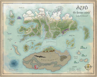
Finished an older map. I coloured it, added a few things and corrected some mistakes.
I'm still not entirely happy with the way it turned out, but I'm not quite sure what's causing it.
While I love praise, serious critiques are very welcome (Smile)")
Pencils, micron pens, A3 paper, Photoshop CS4.
The background paper is "Old Paper" by Struck_Dumb [link]. Again. Because it's the best one I've found so far
EDIT:
I've made a few changes to the original coloured version, which can be found here: [link]
Special thanks to
-ScotlandTom [link]
-jpb06 [link] and
-west2 [link]
for their suggestions.
I'm still not entirely happy with the way it turned out, but I'm not quite sure what's causing it.
While I love praise, serious critiques are very welcome
Pencils, micron pens, A3 paper, Photoshop CS4.
The background paper is "Old Paper" by Struck_Dumb [link]. Again. Because it's the best one I've found so far
EDIT:
I've made a few changes to the original coloured version, which can be found here: [link]
Special thanks to
-ScotlandTom [link]
-jpb06 [link] and
-west2 [link]
for their suggestions.
Image size
3280x2313px 7.07 MB
Make
Canon
Model
CanoScan 5600F
Comments43
Join the community to add your comment. Already a deviant? Log In
Ok as i have no idea what kind of kingdom this map shows or what is the story behind it I only will write about the artistic aspects.
When I first saw this map I thought of Middle Earth. Your style is really equal still I have to say prefer yours. I like the fact that everything is clearly lined and that you refrained to much details. Also I think it's great that you used only a few tree symbols inside the woods instead of filling everything out. The same for the water and everything else.
The colouring is great. You used a little shadows which gives the whole landscape kind of a plastic look. I also like the coloured frontiers. Only the colours of the lands around "Cen Heddan" and "Tranto" look a little strange to me - but I can't tell you why. Maybe there's a little to much colour in there.
The shade of the paper used and the marks and spots here and there make it look like it was really an old map. The handwriting is clearly but unique and completes the realistic look.
The only thing that really disturbs me is that you can see the pencils lines on some spots, e.g. aorund the writing "Attavir" or the "River Tirvarelle". Maybe you could have a look and erase that?
All in all this map is an amazing work and really realistic. I wish I could draw a map like this. Great work!